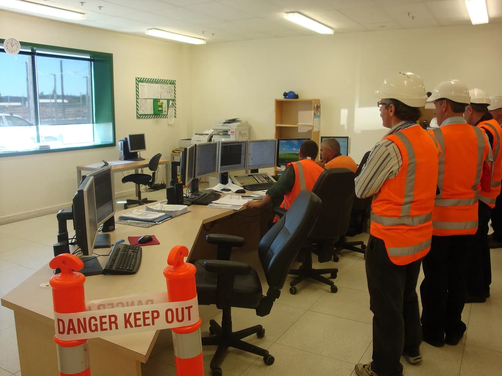
ISA-101 HMI design refers to the approach set out in ANSI/ISA-101.01, the standard for human machine interfaces in process automation systems. Its core idea is that screens should help operators detect and respond to abnormal situations quickly, not look like photographs of the plant. In practice that means a defined HMI philosophy and style guide, a hierarchy of displays, muted colours for normal operation and colour reserved for things that need attention.
ISA describes ISA-101.01-2015 as a framework for designing and managing HMIs across their lifecycle, covering human-centred design, display structure, operator interaction and training, and applying to continuous, batch and discrete industries. A supporting technical report, ISA-TR101.01-2022, covers the HMI philosophy document in more depth.
The HMI lifecycle
ISA-101 treats the HMI as something designed, built, operated and continuously improved, not drawn once by whoever programs the PLC. The main documents are:
- HMI philosophy: the principles, such as how operators use displays, what colour means, how alarms are shown
- HMI style guide: the concrete rules, such as fonts, symbols, colour codes, layouts and navigation
- Toolkit: the library of reusable symbols and faceplates that implement the style guide on your platform
- Display specifications: what each screen must show for its task
High Performance-HMI Done Right
International Society of Automation - ISA
This video is hosted on YouTube. Playing it loads content from Google, which may set cookies.
Watch on YouTubeDisplay hierarchy: four levels
| Level | Purpose | Example |
|---|---|---|
| 1. Overview | Whole area status at a glance, key indicators | Plant or line overview with trends of main KPIs |
| 2. Unit control | Normal operation of a unit or machine | Filler, reactor or packing line screen |
| 3. Detail | Equipment detail for diagnosis | Pump, valve group or drive detail |
| 4. Diagnostic | Troubleshooting and maintenance | Interlock status, device diagnostics, I/O |
Most legacy HMIs have only levels 2 and 3, drawn as P&ID copies. Adding a real overview, showing whether the area is normal and trending in the right direction, is often the single biggest improvement.
Colour and graphics: less is more
High-performance HMIs use a neutral grey background and dark grey equipment for normal states, with bright colour reserved for alarms and abnormal conditions. When everything is colourful, nothing stands out. Analogue values are shown with context, such as a moving indicator against normal and alarm ranges, rather than as bare numbers. Trends replace many single values, because operators judge direction and rate of change faster than they read digits.
Alarms belong in the design
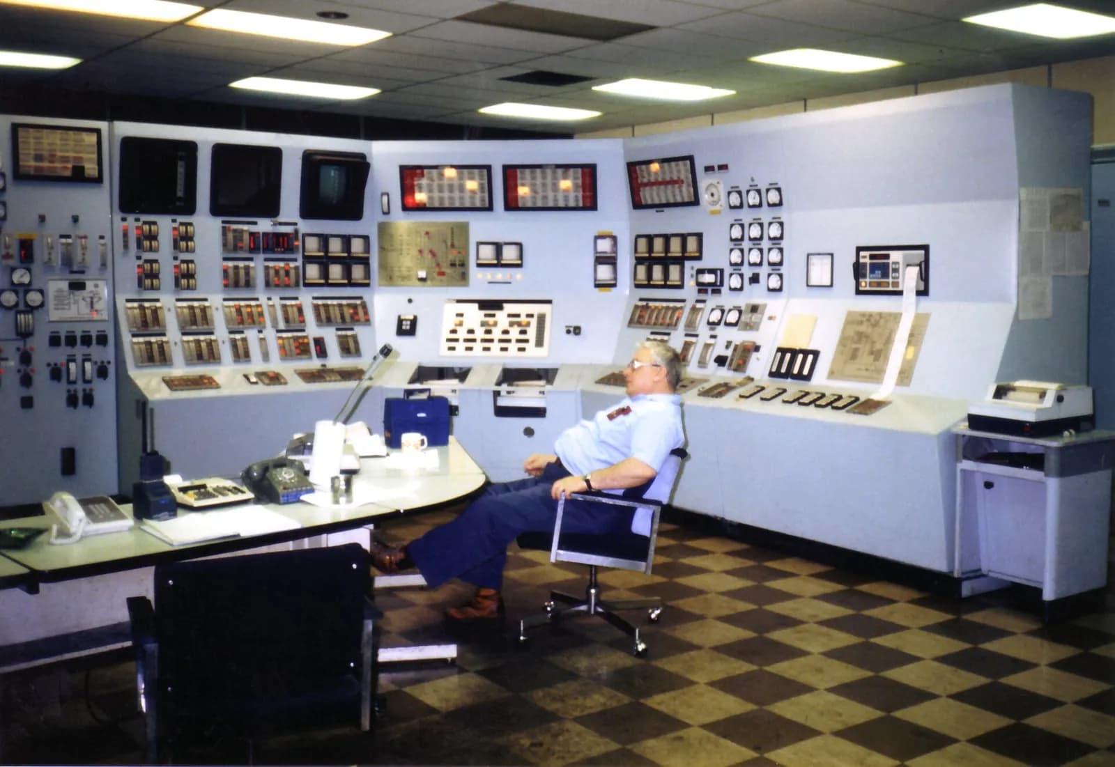
Screens and alarms must be designed together. ANSI/ISA-18.2-2016 covers the alarm management lifecycle: philosophy, rationalisation, implementation and performance monitoring. A beautiful HMI with an alarm flood is still a bad HMI. Common guidance, including EEMUA 191, also stresses that every alarm must require an operator action.
How to modernise an existing HMI
- Write a short HMI philosophy and style guide before touching screens.
- Build or adopt a symbol and faceplate library on your platform, such as WinCC Unified, FactoryTalk View or Ignition.
- Start with one area: add a level 1 overview and redesign its level 2 screens.
- Test with operators using realistic scenarios, ideally on a simulator, and refine.
- Rationalise the alarms for that area at the same time.
- Roll out area by area, and train operators on the new conventions.
Navigation and layout rules that work
- A fixed navigation bar in the same place on every screen, with the alarm summary always one click away
- Process flow from left to right and top to bottom, matching how operators think about the line
- Equipment names and tag numbers that match field labels, so a screen can be checked against the plant
- Faceplates that open in a consistent place and show mode, status, setpoint, output and interlocks
- No more information on a level 2 screen than an operator needs for normal running
Navigation is where many otherwise good HMIs fail. If an operator needs to open five screens to answer a routine question, the design is working against them. Watch operators during a normal shift and during an upset; the clicks they make and the paper notes taped to the console tell you what the screens are missing. Those notes are free requirements: each one is information the operator needed and could not find quickly enough on the HMI.
Machine HMIs, not only control rooms
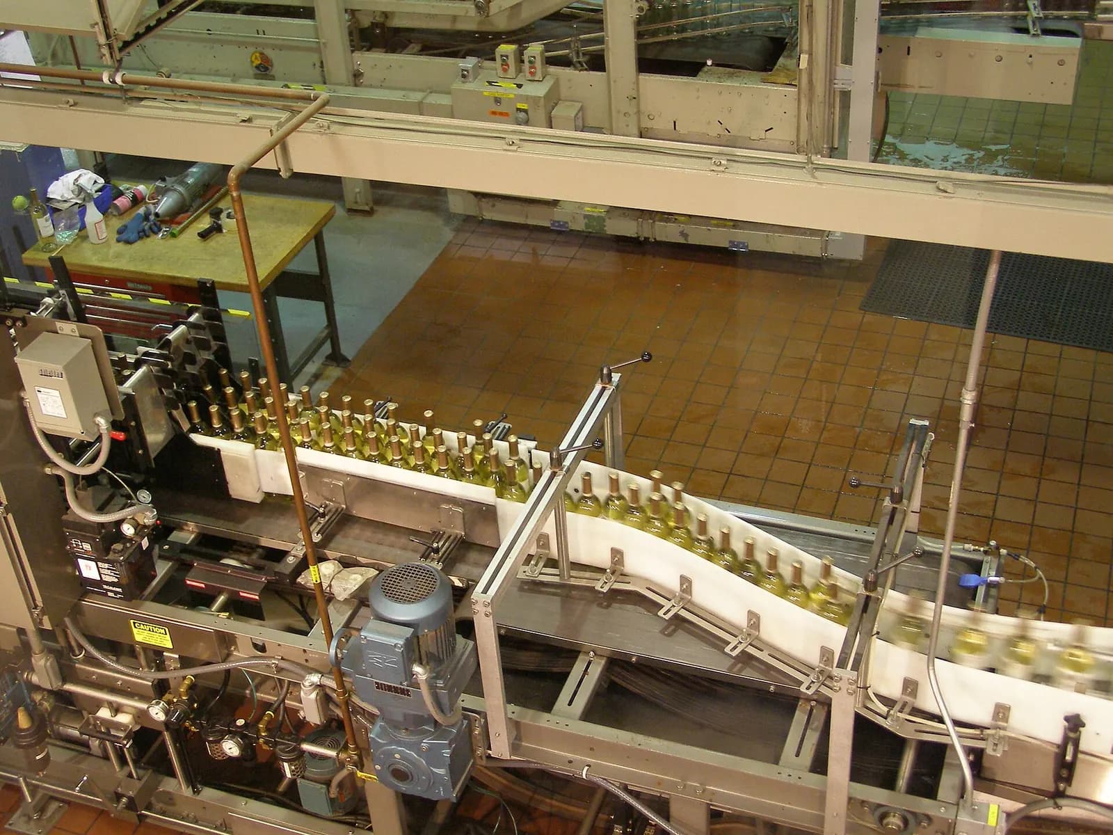
Although ISA-101 was written with process control rooms in mind, the same thinking improves panel HMIs on machines. A packaging machine screen that shows its PackML-style state, the current fault and the next action needed is far more useful than a photo-realistic drawing of the machine. Small screens make discipline even more important, because every element competes for space with the information the operator needs most.
Testing HMIs before start-up
Operators should see and use new screens before the plant starts. Connecting the HMI to a simulated process lets them practise start-up, shutdown and abnormal situations, and gives designers feedback while changes are cheap. The same model used for virtual commissioning can drive HMI training, and the FAT is the natural point to collect operator comments.
How Wartens can help
Wartens designs HMI and SCADA systems alongside the PLC software, with screens reviewed with operators before site. See our automation engineering service or contact us for an HMI review.