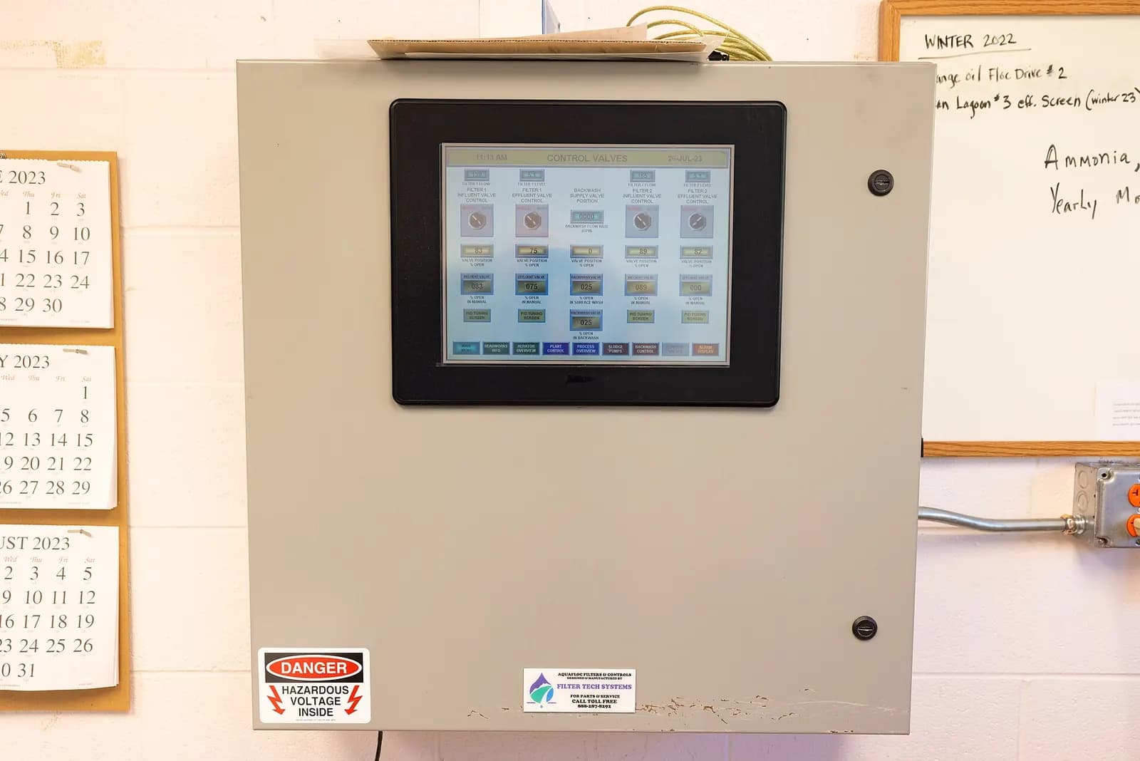
A high-performance HMI is an operator interface designed so that abnormal conditions stand out immediately and normal operation fades into the background. In practice that means gray backgrounds, muted equipment graphics, color reserved for alarms and abnormal states, values shown against their normal ranges, and a display hierarchy from plant overview to detail. ANSI/ISA-101.01-2015 is the standard that sets out how to design, build and maintain HMIs this way.
What ISA-101 is, and isn't
ISA-101 covers human-machine interfaces for process automation with a lifecycle approach: design, implementation, operation and continuous improvement. The series now includes the main standard, ISA-101.01-2015, and technical reports on HMI philosophy and on usability and performance, and ISA says it applies to continuous, batch and discrete industries (ISA-101 series). InTech notes that the standard was released in July 2015, that its lifecycle draws on ISA-18.2 for alarms and ISA-84 for safety systems, and that it was approved in 2020 for development as an IEC standard (ISA InTech, 2020).
ISA-101 does not hand you a color palette or a symbol library. It asks you to write an HMI philosophy and a style guide for your site, then build and maintain screens to them. That is good news: you can apply it on any platform.
The core design principles
- Gray, not color, for normal. Equipment in its normal state is drawn in neutral tones. Color is saved for things that need attention.
- Show ranges, not just numbers. A value next to a small bar showing its normal band tells the operator far more than the number alone.
- Consistent alarm colors and shapes, tied to alarm priority, and never reused for anything else.
- Less animation. Spinning pumps and flowing pipes add noise without information.
- Navigation by hierarchy, so operators always know where they are and how to get to detail.
Inductive Automation's Travis Cox summarized the idea on an Automation World podcast: grayscale instead of bright colors, contrast between critical and noncritical states, and ranges rather than raw numbers. He credits the 2008 High Performance HMI Handbook by Hollifield and Habibi as the work that shaped the approach (Automation World, August 2023).
High Performance-HMI Done Right
International Society of Automation - ISA
This video is hosted on YouTube. Playing it loads content from Google, which may set cookies.
Watch on YouTubeThe four-level display hierarchy
| Level | Purpose | Example |
|---|---|---|
| Level 1 | Overview of the whole area of responsibility | Plant or line KPIs, key trends, alarm summary |
| Level 2 | Unit or process area control | Filler, mixer, conveyor section |
| Level 3 | Detail of a piece of equipment | Pump with interlocks and diagnostics |
| Level 4 | Support and diagnostics | Faceplates, help, trends, procedures |
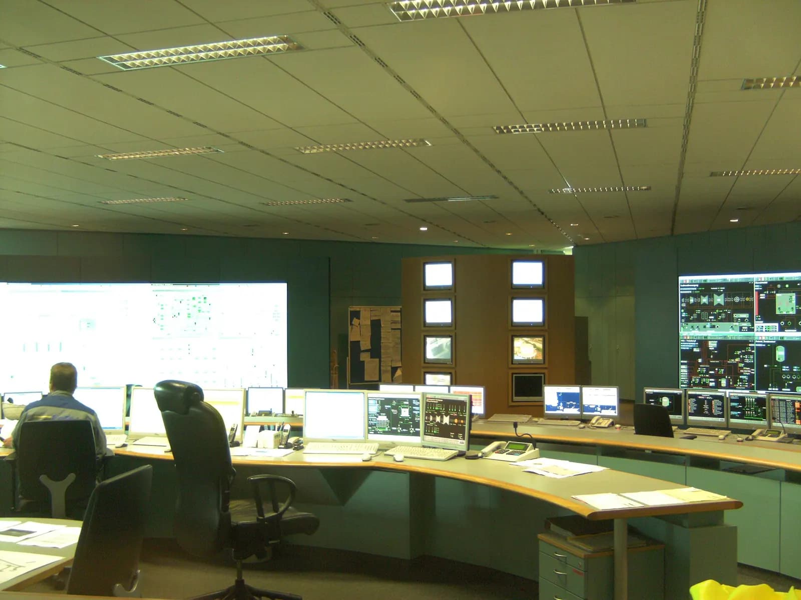
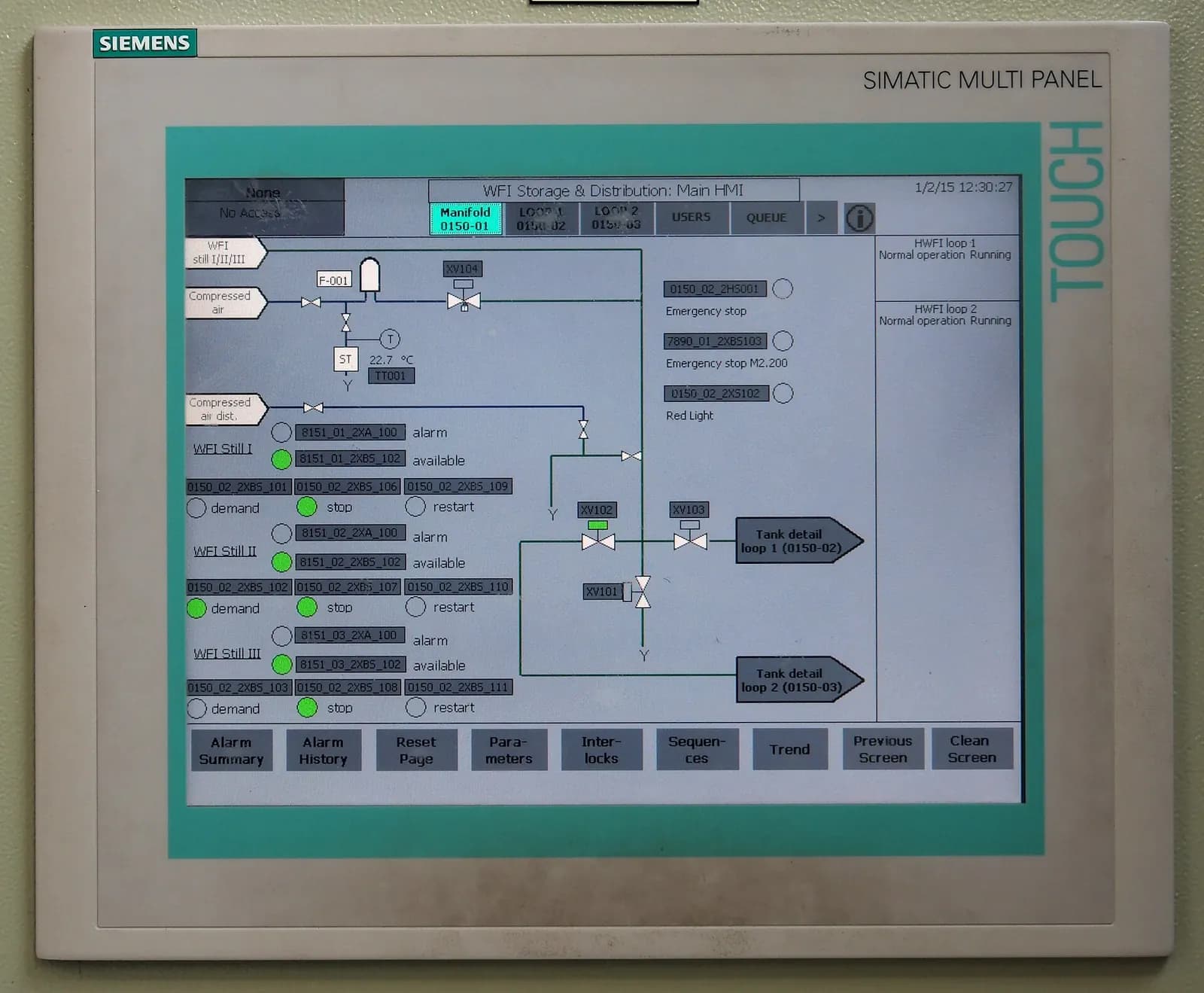
ISA's InTech describes ISA-101's four-level display hierarchy and notes that a large-screen Level 1 overview of critical parameters, combined with well-designed Level 2 displays, can let a site reduce the number of monitors operators need (ISA InTech, February 2023). Most legacy HMIs jump straight to Level 3 detail screens, which is why operators end up flicking between twenty screens during an upset.
Alarms and HMI go together
A beautifully designed screen cannot rescue an alarm system that floods operators with hundreds of alarms per hour. ISA-101 and ISA-18.2 work together: rationalize alarms first, assign priorities, then design how each priority appears on the HMI. The Abnormal Situation Management Consortium, a group of process companies and universities, has worked on the same human factors for years (ASM Consortium).
Designing for the operator's real day
Good HMI design starts with what operators actually do. Spend a shift in the control room or on the line before drawing anything. Watch which screens are opened most, which values people check by walking to the machine, and which alarms they acknowledge without reading. Those observations tell you what belongs on Level 1 and what can move down the hierarchy.
Screen layout should follow the process flow left to right and top to bottom, the way operators think about the line. Keep navigation buttons in the same place on every screen. Think about the abnormal day, too. During an upset, operators need to see what changed, what is out of range and what the system is waiting for. Trends with sensible time spans, a clear first-out indication on trips and alarm messages that say what to do all matter more than graphics. A screen that is calm on a normal day and informative on a bad one is the goal.
Migrating an existing HMI
- Write the HMI philosophy and style guide. Colors, symbols, fonts, navigation, alarm display. Two to ten pages.
- Build a template library of faceplates and symbols that follow it.
- Design Level 1 and Level 2 first. These change operator performance most.
- Involve operators. Review mock-ups with the people who will use them, on every shift.
- Run old and new side by side for a period before switching off the old screens.
- Keep it maintained. New screens must follow the style guide, or the system drifts back.
These principles apply on any platform: Ignition, FactoryTalk View, FactoryTalk Optix or WinCC. Our comparison of Ignition vs FactoryTalk View covers platform choice. Our controls engineering team writes HMI philosophies, builds template libraries and migrates screens, testing them against an emulated controller before they reach operators. Contact us for an HMI review, or see how screens can be tested with a virtual commissioning model.